Projects Portal — Onboarding
The multi-step flow a client fills in before their first drone flight — site boundary, coordinate system, design grade files, who to call on site. I rebuilt it so they could get through it without a manager on the phone.
Product designer — the only designer on the project
PM, frontend, Head of Design, and the CS managers as stakeholders
A live flow rebuilt end to end: audit of the existing process, research, concept, every step for desktop, and the notification components the design system was missing.
Clients started finishing onboarding on their own — without calling a manager.
The CS team stopped being the step between a signed contract and a flying drone.
25%
more forms completed by clients themselves
58%
less time from contract to project launch
39%
more initial files collected
Before and after the rebuild.
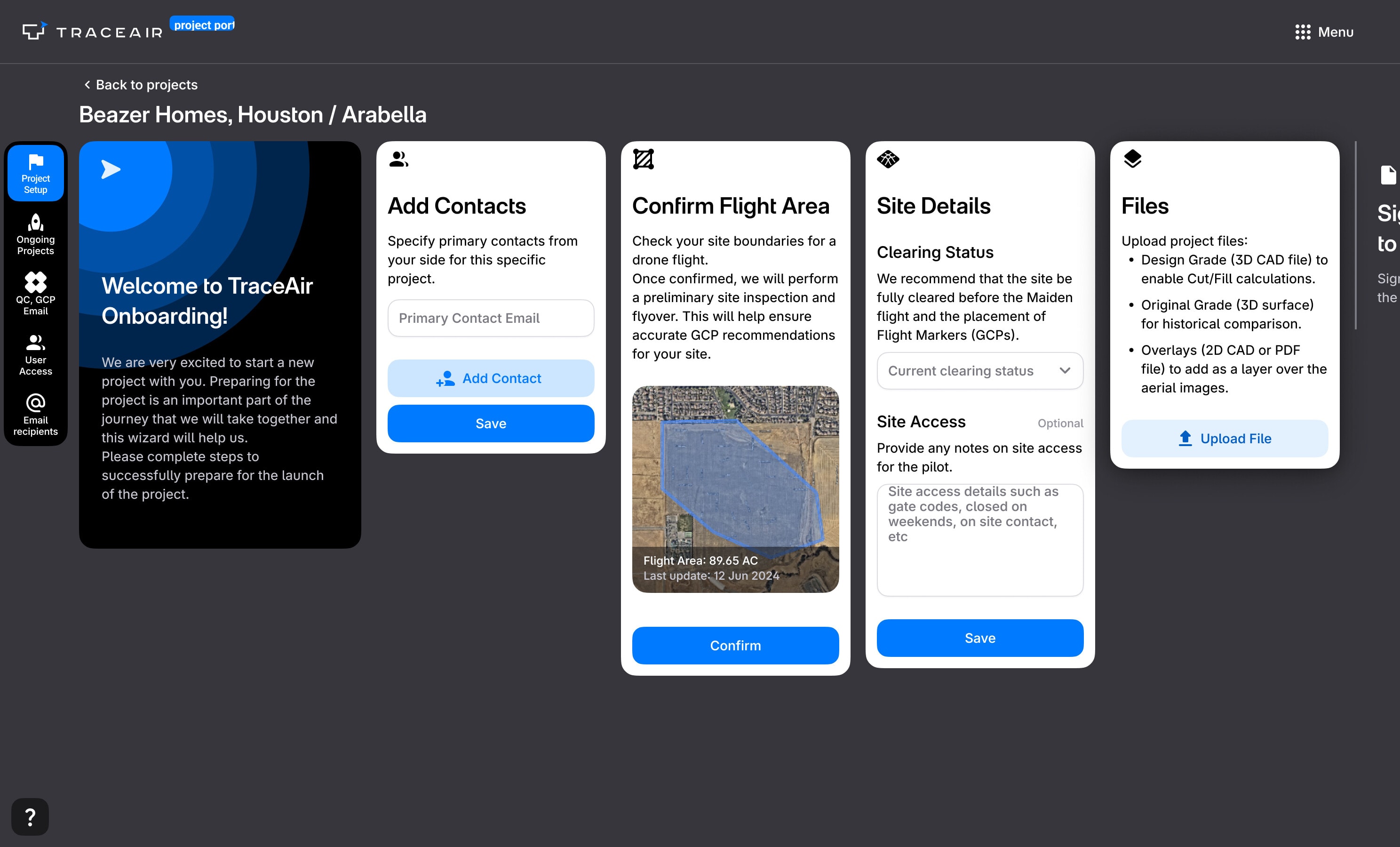 Compare before and after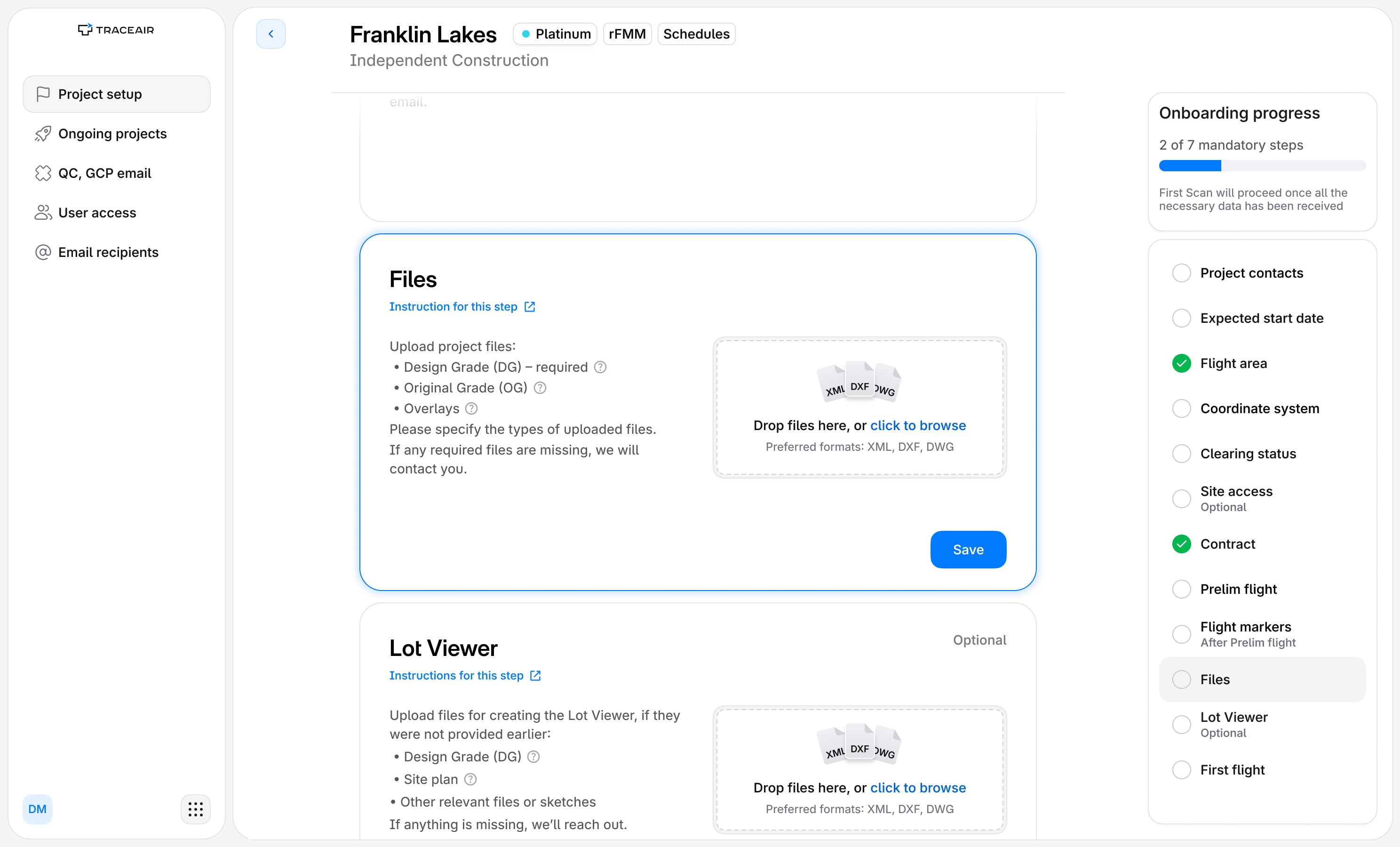
Onboarding confused clients, so a manager finished it for them.
A surge in new clients overloaded the CS team: project launches slowed down, and revenue with them. Hiring more managers was the expensive answer, so we solved it in the interface instead — better self-service, and better client data at the end of it.
A multi-step onboarding flow inside the Projects Portal. What it asks for is specific to each project type — zone coordinates, technical requirements, equipment specs.
Office managers and project coordinators on the client's side — the builder's own staff, not ours, and typically non-technical. They go through onboarding once per new project, and none of the drone survey terminology means anything to them.
- Audit of the current process
- Initiating the redesign
- Research: the CS team's tickets
- Concept
- UX/UI design
- Components for the design system
Confirming a boundary became editing one.
The shape used to come from us and a client could accept it or phone us about it; now they drag a vertex, watch the acreage change, and confirm the area the drone will actually fly.
Every state each step can be in.
Every step runs the same four phases and nothing else about them matches: Coordinate System needs eight cards, Contract two, and every gap in the grid is a state we decided a step does not get to be in.
A grid of onboarding step cards: twelve rows, one per step — point of contact, flight area, clearing status, coordinate system, files, lot viewer, site access, flight markers, contract, prelim flight, expected start date and first flight — against four columns for the phases a step moves through: requested, edited, done, and needing action. Some cells hold two or three cards, where the same state is also drawn in its overdue form or with files attached, and several cells are empty.
Requested
Open, and nothing answered yet.
Edited
The client has put something in. None of it counts until it is accepted.
Done
Confirmed, and counted towards the mandatory steps.
Needs action
Held by another step, or wrong and saying so.
Point of contact
Flight area
Clearing status
Coordinate System
Files
Lot Viewer
Site access
Flight markers
Contract
Prelim flight
Expected start date
First flight
One coordinator, several projects, every blocker on one screen.
A point of contact usually has more than one project in onboarding at a time. The table puts every step of every project in one row, so what is holding a launch up is visible without opening anything.
Telling people what was happening needed components we did not have.
We had one Alert doing every job, and onboarding needs to speak at four volumes, so I built four components and put them in the design system.
Before
Now
What it did not fix, and what came next.
Two things the rebuild left open.
The flow got quiet, and that was the problem: a client who simply stopped was not chased by anything. What was missing was the communication around the interface rather than inside it — reminders, and someone knowing they had gone out — so the next piece of work was a system of emails, and a way for our managers to see and control what had been sent.
And it still asks for too much that is technical. A coordinate reference system is not a question an office manager can answer, however the step is written, so the stage after this one splits onboarding between the manager and their technical consultant — each of them answering the half they actually own.