Pilot App
The internal tool TraceAir's drone pilots run their day on — flight schedule, mission scope, uploads, project documents. I rebuilt it around the 12 jobs pilots actually do.
Product designer — the only one on the project
PM, frontend, Head of Design, managers, the pilot team
A full redesign, end to end: stakeholder interviews, JTBD mapping, every flow and screen for desktop and mobile, 5 rounds of usability testing, handover to frontend, research after release.
Pilots run their own flights now, and get fewer of them wrong.
They plan and fly the day themselves, including on site on a phone, where the mobile version is far easier to work with. Upload errors now surface while a pilot can still fix them, so fewer flights have to be re-flown — which cut the cost per flight, one of TraceAir's core operational metrics.
12%
fewer repeat flights
58%
less pilot ↔ manager back-and-forth
39%
more mobile usage
Before / after
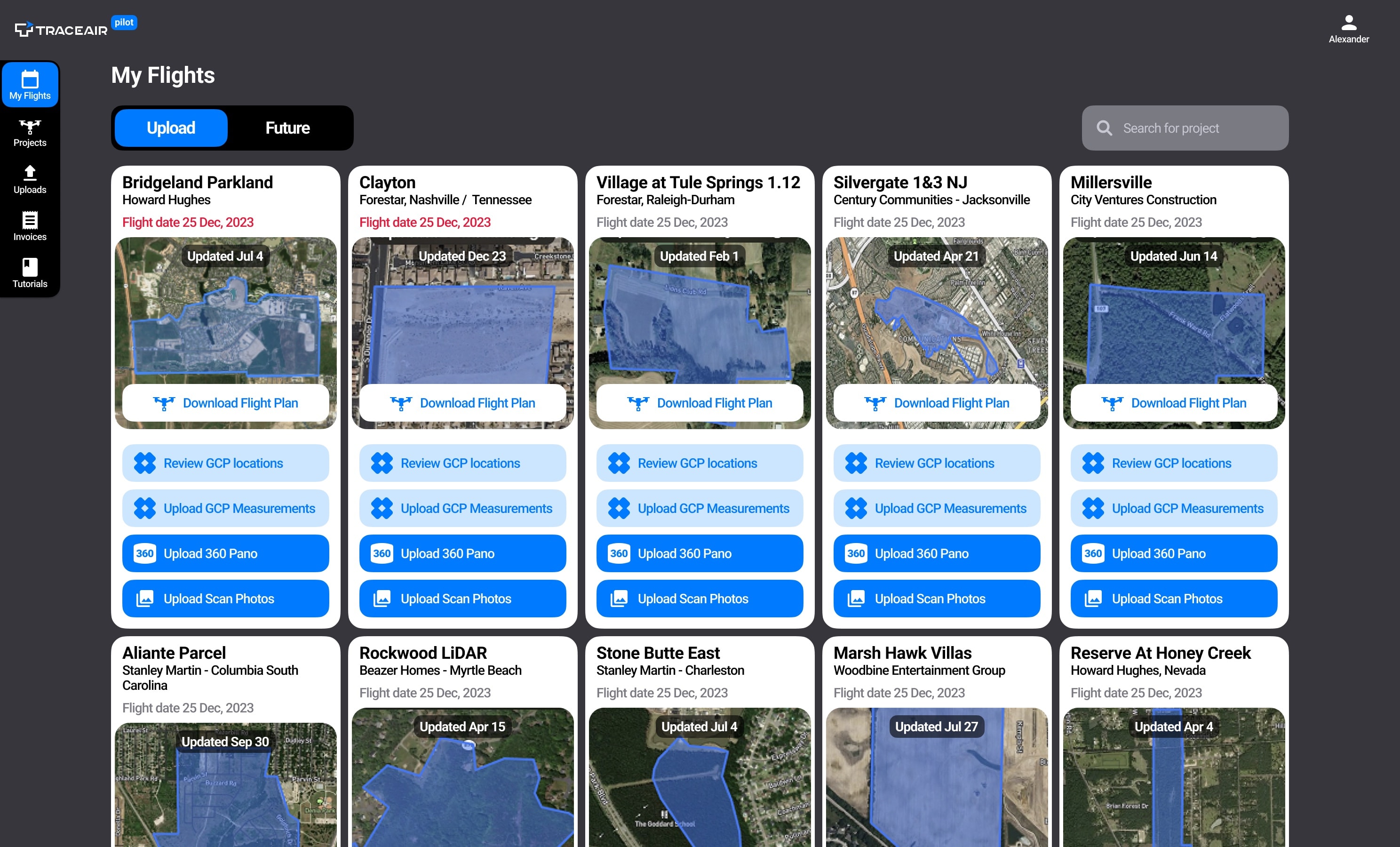 Compare before and after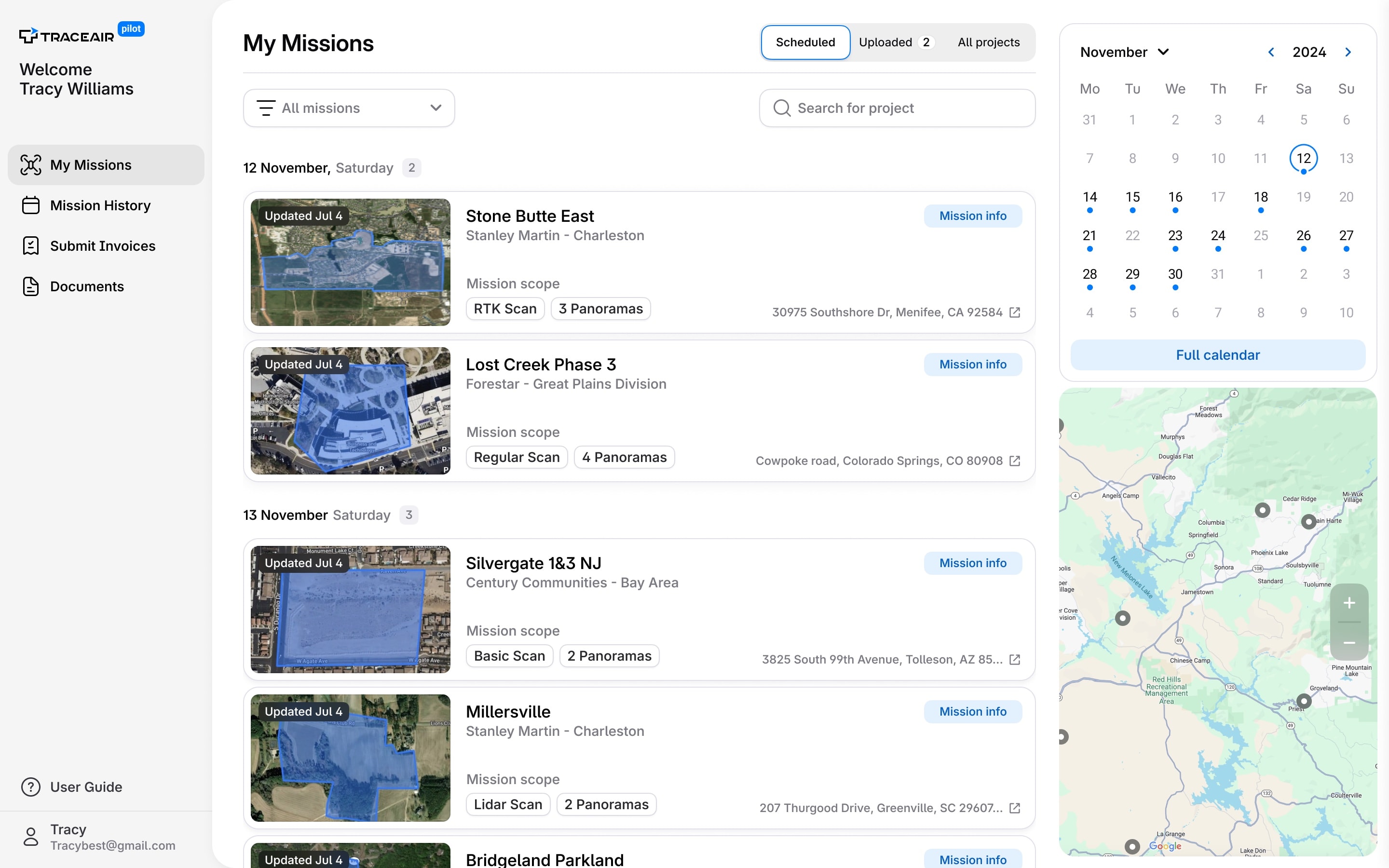
Drone pilots made numerous errors during flights, which cost the company a lot of money.
Pilots couldn't see everything they needed in one place. Missing info, unclear status, no context — and a message to a manager every time something was unclear.
Pilot App is an internal tool used by drone pilots at TraceAir to manage their daily work: view flight schedules, track mission uploads, track invoices, and access project documents.
Drone pilots who also do surveying work — capturing aerial scans, measuring ground control points, uploading data. Often outdoors, on mobile.
I initiated the redesign myself and then ran all of it — the first stakeholder interviews, the JTBD map, every flow and screen for desktop and mobile, five rounds of testing, handover to frontend, and the round of research after release.
We mapped every job pilots actually do — including the ones they were skipping because the old app made them too painful.
Then I built prototypes and walked the main flows with pilots, one call at a time. Five rounds of that before release.
Methodology
- JTBD mapping with the pilot team: 12 jobs written down and ranked
- 5 rounds of usability testing on clickable prototypes, one pilot per call
Research goals
- Map every job a pilot does in a day, including the ones they had quietly stopped doing in the app
- Find where the old app loses them — missing info, unclear status, no context
- Validate the new flows with real pilots before a line of it was built
Key tasks
- Plan a day: find the missions, check the scope, work out the order
- Upload several missions in one go and spot what didn't land
- Open a mission on a phone, on site, and find what to capture
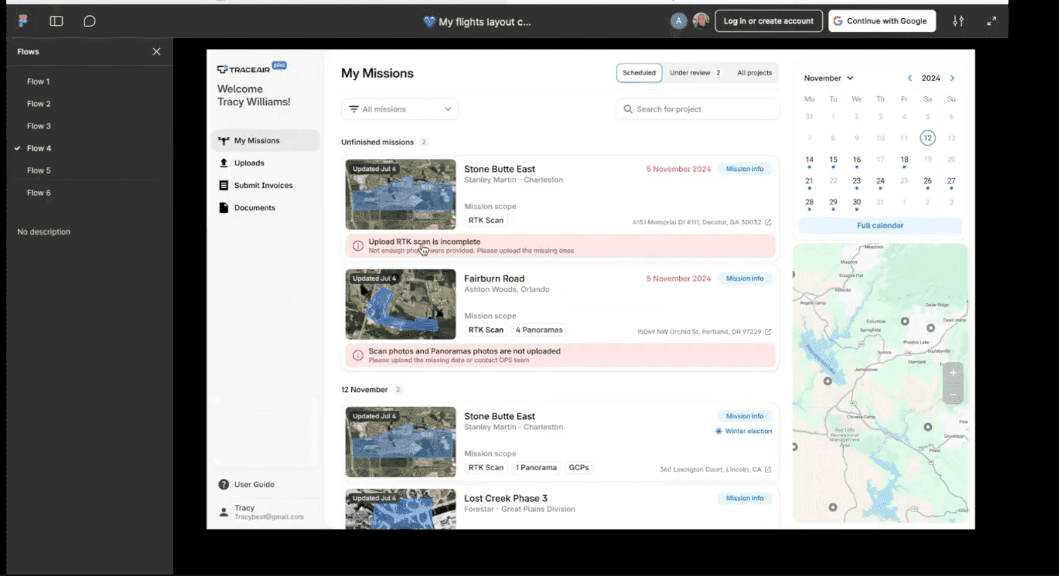


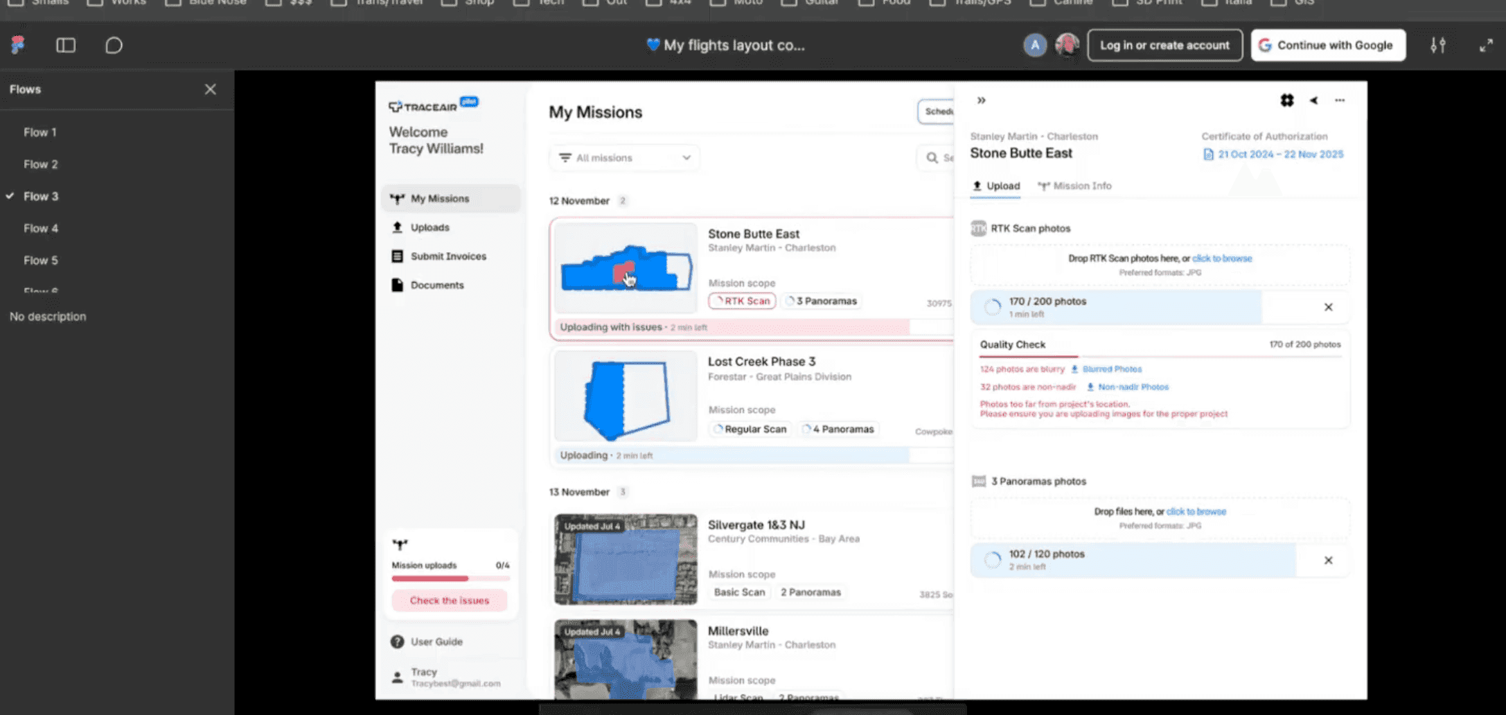


Research insights
Every unclear thing ended in a message to a manager. The app never gave a pilot the whole picture of a mission, so a person had to fill the gap.
Upload problems surfaced too late — long after a pilot had left the site, which is what turns into a repeat flight.
Pilots plan the day by geography, not by a list of site names, so the order of the day was worked out from memory every morning.
A week is the unit pilots actually plan in, and the old app could only ever show them one day of it at a time.
The app was built to be read at a desk, and the moment it mattered most the pilot was outdoors holding a phone.
Jobs the old app made painful were quietly skipped — invoicing worst of all, which left nobody able to say what a flight had cost.
Four daily jobs, and what each one needed.
Check mission info
- Problem
- Problem. Mission details sat in documents, chats and managers' heads. A pilot could be on site and still not know the full scope.
- Solution
- Solution. Everything a mission needs is on the mission itself — scan area, panorama coordinates, GCP request, coordinate systems — one click from the list.
Upload several missions at once
- Problem
- Problem. Three to nine uploads went off at once with no per-mission state. Nothing said whether the data was any good until someone downstream found out it wasn't.
- Solution
- Solution. Every mission uploads with its own progress, and a quality check flags blurry and non-nadir photos while the pilot is still close enough to re-fly.
Use the map to navigate
- Problem
- Problem. A pilot plans the day by geography — fly the sites that sit near each other, one after another. A list of site names says nothing about where anything is, so the order of the day was worked out from memory.
- Solution
- Solution. Missions on a map, grouped by area, so the shape of the day is visible before anyone gets in a car.
Use the calendar to schedule
- Problem
- Problem. Pilots plan a week at a time, and the old app could only show them one day's worth of it.
- Solution
- Solution. A calendar view with every upcoming mission on it — the week readable at a glance.
In the field, everything is one tap away.
Everything a pilot needs on site
- Problem
- Problem. The app was built to be read at a desk, and the moment it mattered most the pilot was outdoors holding a phone — with no way to tell which missions were still outstanding.
- Solution
- Solution. A mobile mission list and mission view that answer it all on one screen: what is still open, which mission this is, what the scope is, what to upload.
The app catches what went wrong, not the pilot
- Problem
- Problem. Nothing flagged an unfinished mission or checked an upload — a bad scan surfaced long after the pilot had left the site.
- Solution
- Solution. Unfinished missions rise to the top and say what is missing. Uploads check themselves and name what failed while the pilot can still re-fly.
Then a second problem turned up: nobody could say what a flight had actually cost.
I found this in the pilot interviews: they invoiced with a PDF and a lump sum, and operations took it apart again by hand — split across invoice review, GCP and LiDAR cost work. Almost none of that spend was stored in a shape anyone could report on. So invoicing became the next thing the app had to do.
$50k+
a year lost to inaccurate cost data
~32 h
a month reconciling invoices by hand
−20 h
a month of pilot ↔ manager back-and-forth
Every invoice, and where it stands
- Problem
- Problem. A pilot sent a PDF and then waited. Nothing in the app said whether it had been picked up, queried or paid, so — like everything else in the old app — the answer came from messaging a manager.
- Solution
- Solution. One list of everything a pilot has invoiced: the period, what was in it, the total, and the status — submitted, needs a fix, awaiting payment, paid.
The invoice builds itself out of the work
- Problem
- Problem. A pilot couldn't say what they were owed — LiDAR, panoramas, materials and equipment leasing all disappeared into two aggregate numbers, so checking an invoice meant reading the PDF by hand.
- Solution
- Solution. The invoice arrives already built, priced straight from the pilot's contract. They check it instead of assembling it, and anything that doesn't add up is flagged before submit.
After the release we interviewed the pilots again — and found new things.
Pilots want more control
They want to see how a site is developing overall — the current stage, how often it's flown, whether the project is finished — so they can plan their own schedule ahead.
Instructions for technical procedures
Every year we ask pilots to do more complicated things, and they don't have the instructions at hand at the moment they need them.
Clear notifications when a project changes
A mission's scope, date or site can change after a pilot has planned around it, and today they find out by reading a Telegram thread. They want the app to tell them what changed, on the mission it changed on.
8.2
average app score, latest poll